
 For the past two days we have been striking all of the type from posters that have been printed in the past but hadn't been put away yet. It's a great way to learn what's in the shop, and where it goes! Though it'll probably take a long time to remember it all, I feel better about it now than I did when I first walked in.
The best part about working at Hatch is being around some amazing design work. Literally all of the walls are covered in show posters (well, excluding the walls that aren't covered in type). This poster for John Prine I was particularly drawn to, designed by Brad:

 I think one of my favorite things about letterpress is the ability to layer colors and textures, and I think this poster in particular utilizes it stunningly. I also love that it's a simple black and white color pallet. Proves you don't have to use color to make something visually arresting!
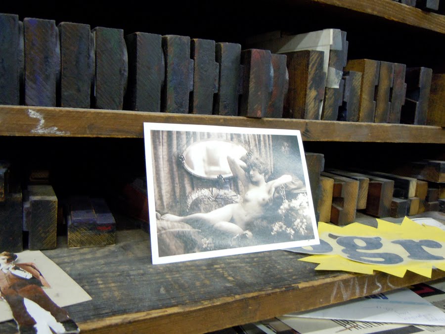 Also, I got to walk past this stunning postcard all day. What could be better?
No comments:
Post a Comment