Usually I wait to post photos of a completely finished project, but sometimes it's fun to see the beginnings! I had a great meeting with a new wedding client the other night, and was putting their inspiration board together on Pinterest (and getting really excited about it) so I decided to share a snapshot!
I'll try to post in-progress photos of the project as I work on it. Stoked!
{<3 Stephanie}
Wednesday, October 5, 2011
Sunday, October 2, 2011
Twig & Fig: Halloween Display
One of the perks of managing a retail store is I have the freedom to set up creative seasonal displays! I took the initiative with Halloween coming up to create a few decorations for a Fall display at Twig & Fig, inspired by lots of fun things I've been pinning on Pinterest (See my full Halloween board here!)
 I found a template online for these maple leaves, and cut them out of some of our handmade paper to make a leaf garland.

 Overall, I'm pretty excited about it! It was really fun to figure out how to best display fall-related products, without the decorations I made overpowering them. I'm looking forward making more fun displays for Christmas!
 I found a template online for these maple leaves, and cut them out of some of our handmade paper to make a leaf garland.
Then, inspired by the feature article on Country Living this month, I tried my hand at decoupaging pumpkins, also with some of our handmade paper.

 Overall, I'm pretty excited about it! It was really fun to figure out how to best display fall-related products, without the decorations I made overpowering them. I'm looking forward making more fun displays for Christmas!
{Sincerely, Stephanie}
Wednesday, September 7, 2011
Amy & Patrick: Wedding Fans
It's been a while since my last post, I have been busy transitioning and creating lots of fun new stuff! I am so excited about one of my most recent wedding clients, Amy & Patrick, who hired me to design and letterpress them some custom Program Fans. Enjoy!


All this gorgeous photography by Azuree Witala
Sunday, June 12, 2011
Updates: Coming Back Home

We Moved!
John and I drove a UHaul full of stuff 800 miles from Seattle to Oakland this weekend, officially closing the chapter of our lives in Seattle. The change was bittersweet: We were both so excited to come back home, but also so sad to leave all of the amazing people we met while living there. I know that we will have a lot of life-long friends from that experience.
For now, I'll be working as a part-time Creative Sales Associate at Paper Source, and hopefully picking up some freelance work. I'm also planning to contact some florists to see if I can apprentice with them and help set up weddings. Excited to try my hand at it!
Friday, May 27, 2011
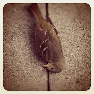
Updates: As Told Through Instagram

A fallen friend on the way to work the other day.

Today was my last day at YIU Studio.
I am so grateful for the experience, and all of the amazing crafty production I was able to do while working there! And it seems only fitting that on my last day, I Japanese bound almost 100 promo books.


And finally, some wedding invites I'm working on this weekend.
They're digital but any wedding is a fun wedding to me! Can't wait to have them all finished to send to the bride on Tuesday.
Tuesday, May 24, 2011
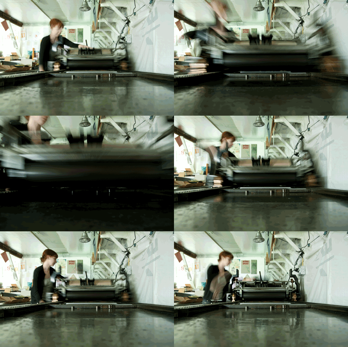
Letterpress in your FACE!
This past week I've been working on production for Dovely, a new product by YIU Studio. Ariel Nay Nebeker came to take pictures of me while I was working at Myrtle Alley Press, and here's an awesome .gif she made!

BAM!

BAM!
Saturday, May 7, 2011
Busy Bee! {Behance Portfolio Updates}
I have been hard at work editing the photos Ariel took of my portfolio a few months ago, and trying out the new Behance ProSite application (basically a CMS website where you don't need to know any code, which is a thumbs-up for me!)
I'm really excited to finally update my portfolio with new work, and share it with all of you.
Here's a sneak peek of the new site:

I'm hoping to launch it in the next few days. For now, take a look through my updated Behance Profile!
{There is also now a link to it on the left hand side of this blog}
Saturday, April 30, 2011
Seattle Chamber Music Society
{I've decided to post past projects as I get around to editing the photos and putting them on my website (the ever-talented Ariel Nay Nebeker re-photographed my work back in March). Here's the first one!}
 While interning at Cognition Studio last fall, I had the pleasure of working on the winter festival campaign for the Seattle Chamber Music Society. The festival includes a 4-day concert series at Benaroya Hall, and a concert catered towards families, which had the theme of 'Babar' this season.
Flyer for Winter Family Concert
Because the imagery had to be 'childlike,' but cater to parents, I decided to play with paper-cutting to give the character of Babar a more sophisticated feel.


The look was applied to postcards and bookmarks as well.
And, I made an animated .gif ad! I also got to design a poster to be hung outside of Benaroya Hall, I also got to design a poster to be hung outside of Benaroya Hall,promoting the concert series. On a slightly unrelated note, I also got to design coasters for an SCMS benefit in January, celebrating Mendelssohn's birthday. It was the first time I've done an illustration for a client (with help from Dave at Cognition), and I had a ton of fun with it! All photographs by Ariel Nay Nebeker |
Monday, April 25, 2011
Seattle Children's Hospital Poetry Broadside
 For the past month, I have been honored to be a part of a project made possible by the School of Visual Concepts and Seattle Arts & Lectures' Writers in the Schools program. Sierra Nelson, a poet with WITS, is the poet in residence at the Seattle Children's Hospital, and has been working with kids there once a week helping to teach them poetry and writing. Sierra picked 12 poems from 12 different students to be turned into letterpressed broadsides by printers at SVC.
  We went around the room to pick our poems, and I was lucky enough to end up with 12 year old Emma's gorgeous poem, which is a blessing dedicated to her brother Owen (who I later found out is also her bone marrow donor).
 Because there was so much imagery in the words, I didn't want to add any additional imagery of my own. Instead, I decided to treat the poem typographically, and call out important phrases in color and wood type.
 The first black layer is all hand-set lead type. I was so excited for the opportunity to hand-set, since I usually end up doing things with polymer. It's good to get some hand-setting practice!
The 12 broadsides will all be collated together into a beautiful portfolio designed by Bonnie Thompson Norman. To unify the different broadsides, we were to print the majority of the poster in black, and then add an accent color of either Process Blue, Process Yellow, or Warm Red (of course, we were allowed to do more than two, but we had to do at least one color).
I chose blue because though my instinct was yellow, I knew the blocks of text would probably start to look like bumble bee stripes.
 The star in the middle of the last sentence was the biggest one in the shop, so to fill in the white space around it (and add the yellow I so desperately wanted!) I decided to do some post-printing spray paint to add a shine to the star. I had to make a jig to make sure the spray paint would be the same size each time.
Friday, April 22, 2011
YIU Studio | Baby Shower Invite
 I am so excited to post this project! I've been interning at YIU Studio in Seattle since January, and Henry (the Creative Director and company founder) will be having a baby boy next month! Since it's the Chinese year of the rabbit, he wanted to make a baby shower invite with that theme. I had the honor of designing and screen printing these (with the help of Ariel Nebeker, the lead designer at Yiu Studio, and design direction from Henry).
 The concept was 'postcard as poster,' since we could only screen print at a specific size. So as the postcard is opened, the type is revealed.
  The bottom portion is a tear-off rsvp postcard, so people can check 'yes' or 'no' and then stick it in the mail.
Wednesday, March 16, 2011
My New Best Friend: Alexander!
 This past November I was lucky enough to be in the right place at the right time, and the amazing Carl Montford had a 5x8 Craftsmen Table-Top Platen press for sale! Having been wanting a real press for quite some time, I jumped on the offer. It didn't need a lot of mechanical work, but it did need a lot of de-rusting TLC. John and I were up for the challenge.
Tuesday, March 15, 2011
& Coasters: Now at Pike Street Press!
 Yesterday I dropped off a few bundles of my ampersand coasters at the recently opened Pike Street Press (underneath Pike Place Market in Downtown Seattle). They have an awesome gallery space where they're selling local letterpress printers' work, as well as a huge Heidelberg press in the back, where they do custom jobs. Such a great space for letterpress!
 The coasters are packaged in bundles of 4, for $10 each. I dropped off five sets of the regular coasters, and one set of just the 'ampersand,' as well as one set with just the type. Hope they do well!
{Awesome photos by Ariel Nebeker, who helped me photograph my portfolio this weekend! More to come once I update my website with them.}
Saturday, February 12, 2011
& Coaster: For the Love of Letterpress
 Today I finished printing coasters for a 'Love & Letterpress' coaster exchange, headed by Catherine from Visual Chemist. I'm super excited to be a part of this exchange, and can't wait to see the coasters everyone else printed! It's an alphabet letterpress theme, so everyone was assigned one letter from the alphabet. Since 'S' was already taken, I chose to do the ampersand.
Sunday, January 16, 2011
10 Recipes: Book Release!
 Well, it's finally done! After 6 months, 5,000 hours (approximately), and lot's of photo cropping, 10 Recipes to Get You Laid is DONE! I had so much fun working on this book, and it's so satisfying to see a project I designed from beginning to end actually published. {UPDATE: Use the discount code 'SLAURSEN' at checkout to get 10% off!}
Subscribe to:
Comments (Atom)


